Scroll to view project
Scroll to view project
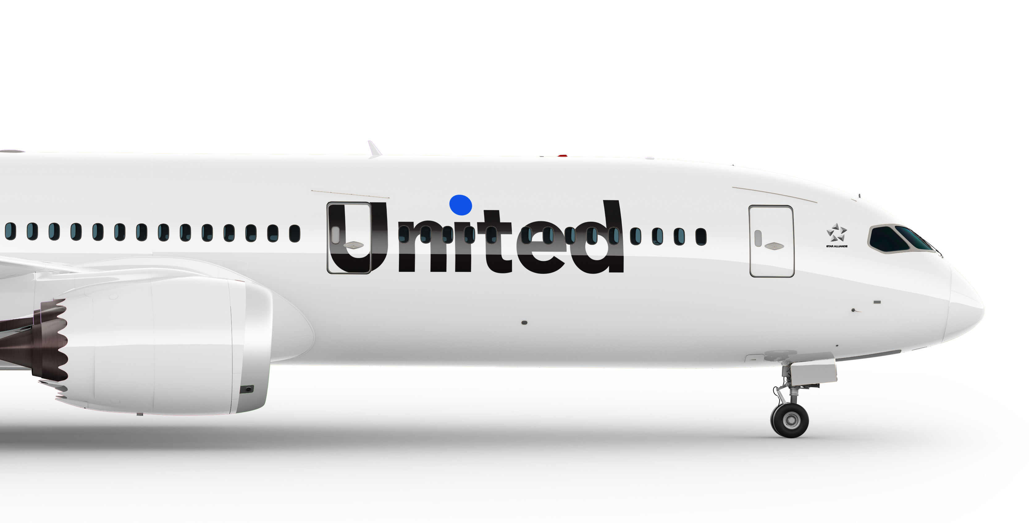
Little needed to be said about consumer perceptions of United Airlines. But with a recent change in leadership, as well as a renewed emphasis on customer experience, United Airlines had a great opportunity to reclaim its position as the world's leading global airline while redefining the brand's relationship with customers and employees.
Most leading global airlines have a strong affiliation to a particular country. With a name like United, the airline feels particularly positioned to be a truly global airline. The word, United, also comes with a beautiful meaning of its own. People are different, regardless of where they're from; United brings people together.

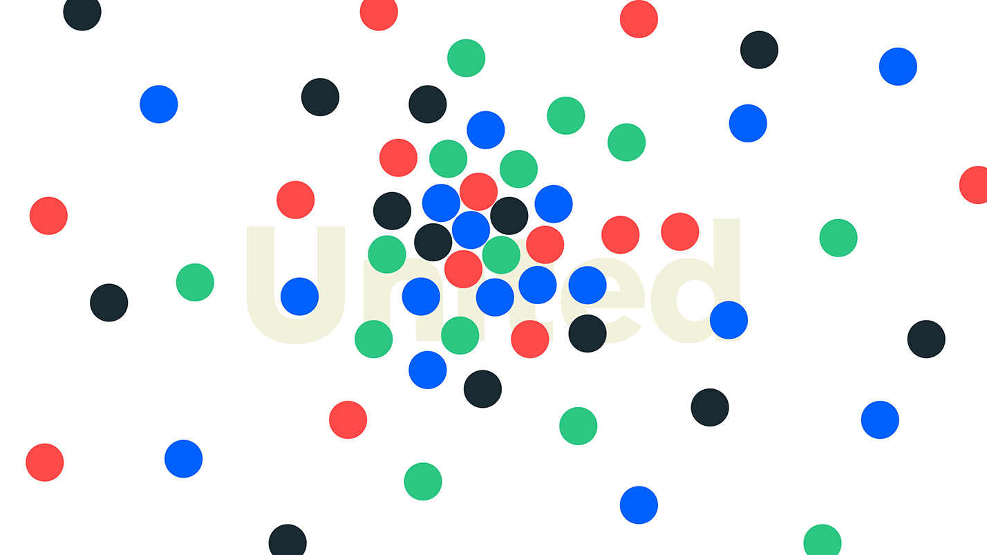
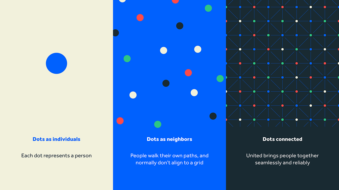
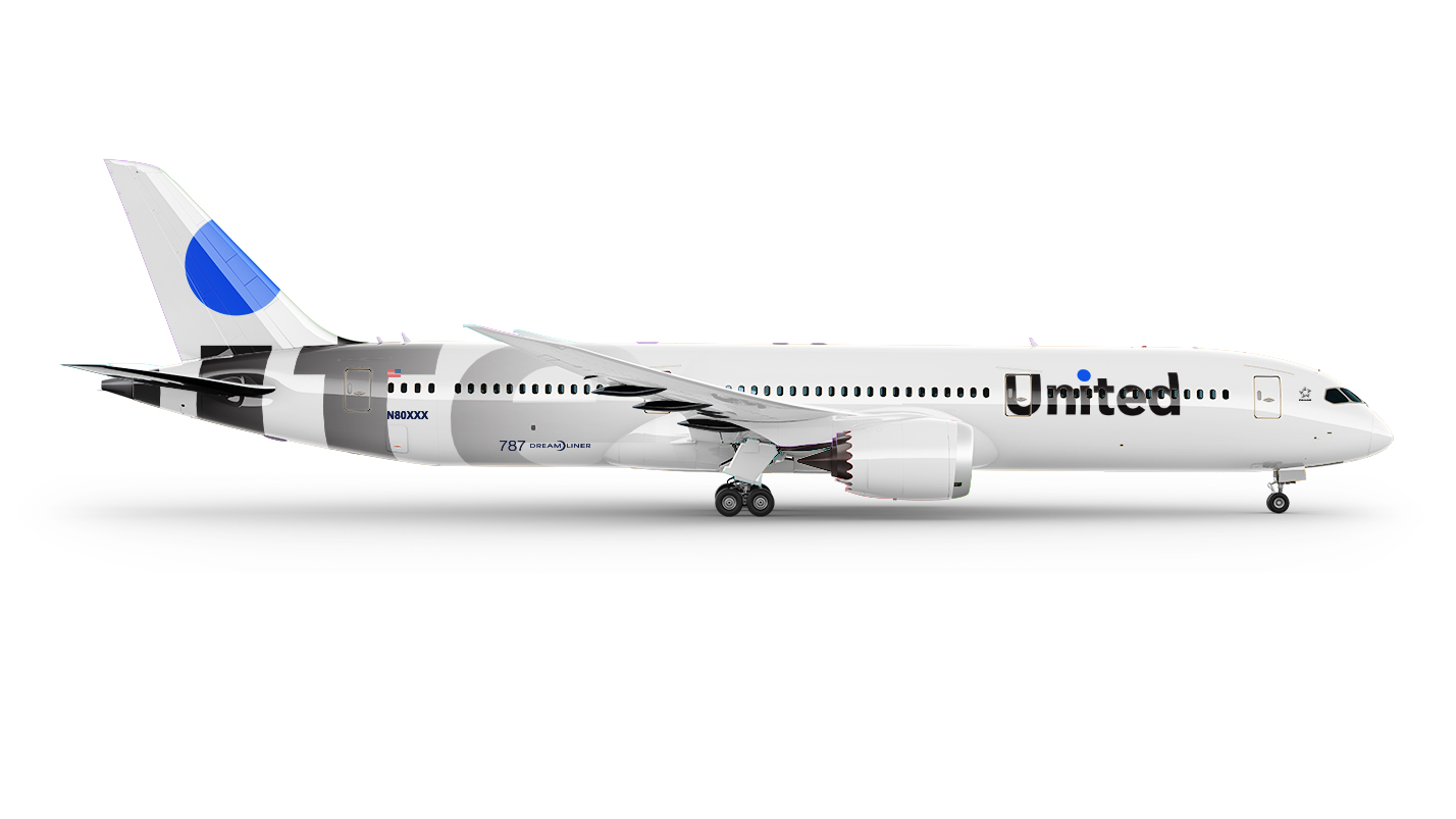
Identity system idea and behaviors: colored dots are people, the lines bring them together
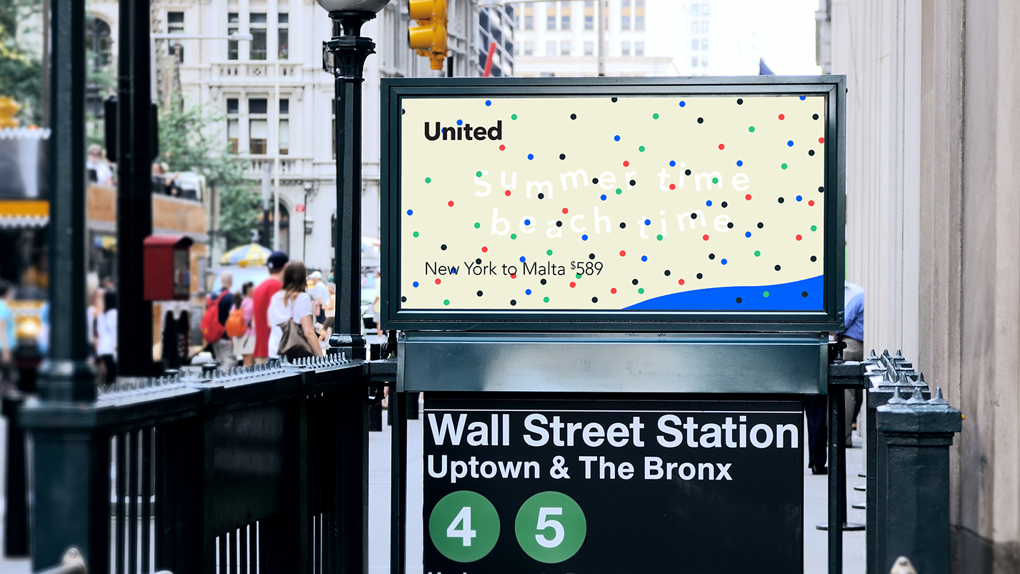
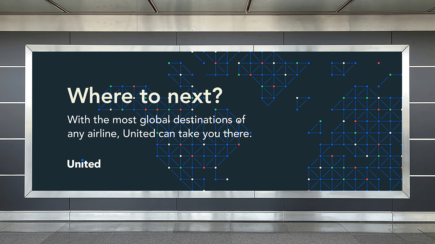
Outdoor advertising: the identity is able to be personable or button-up depending on the situation
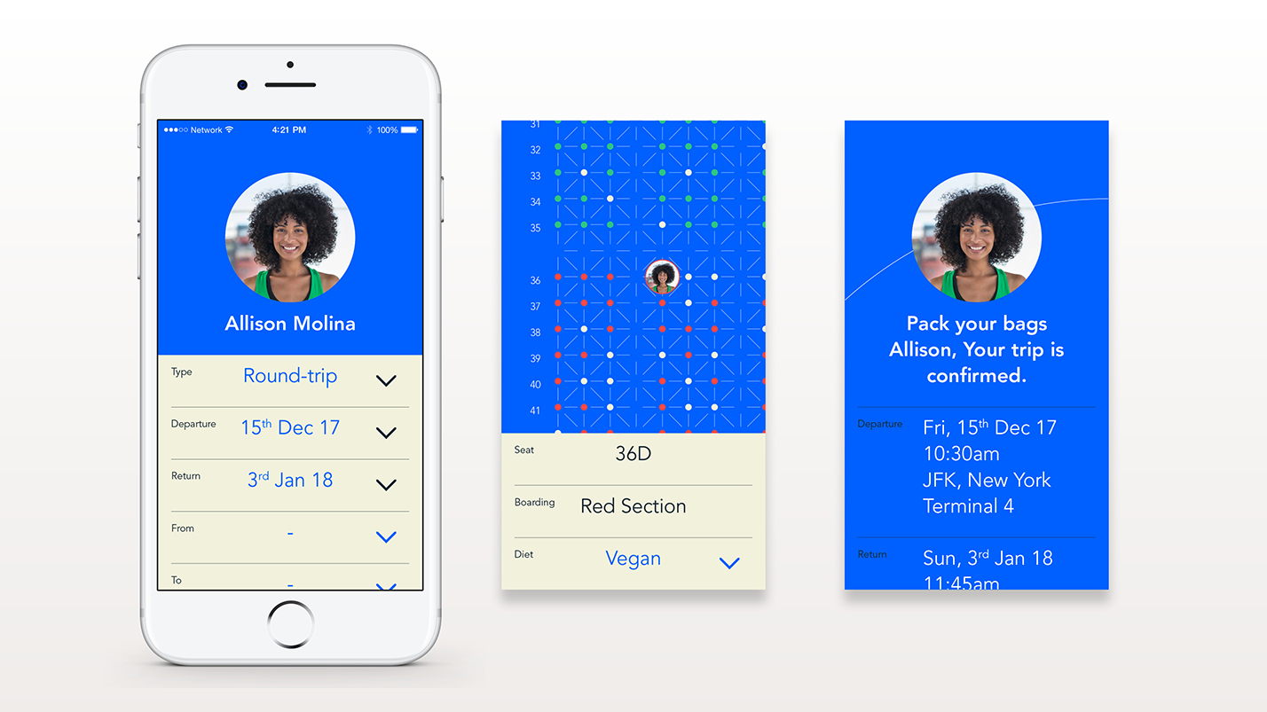
United mobile app: the idea that the dots are people is introduced right from the start
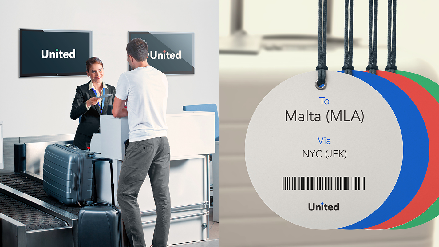
Your dot guides you through your check-in experience
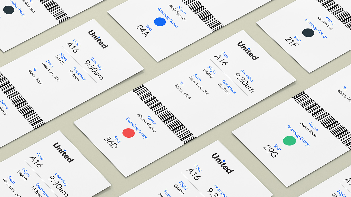
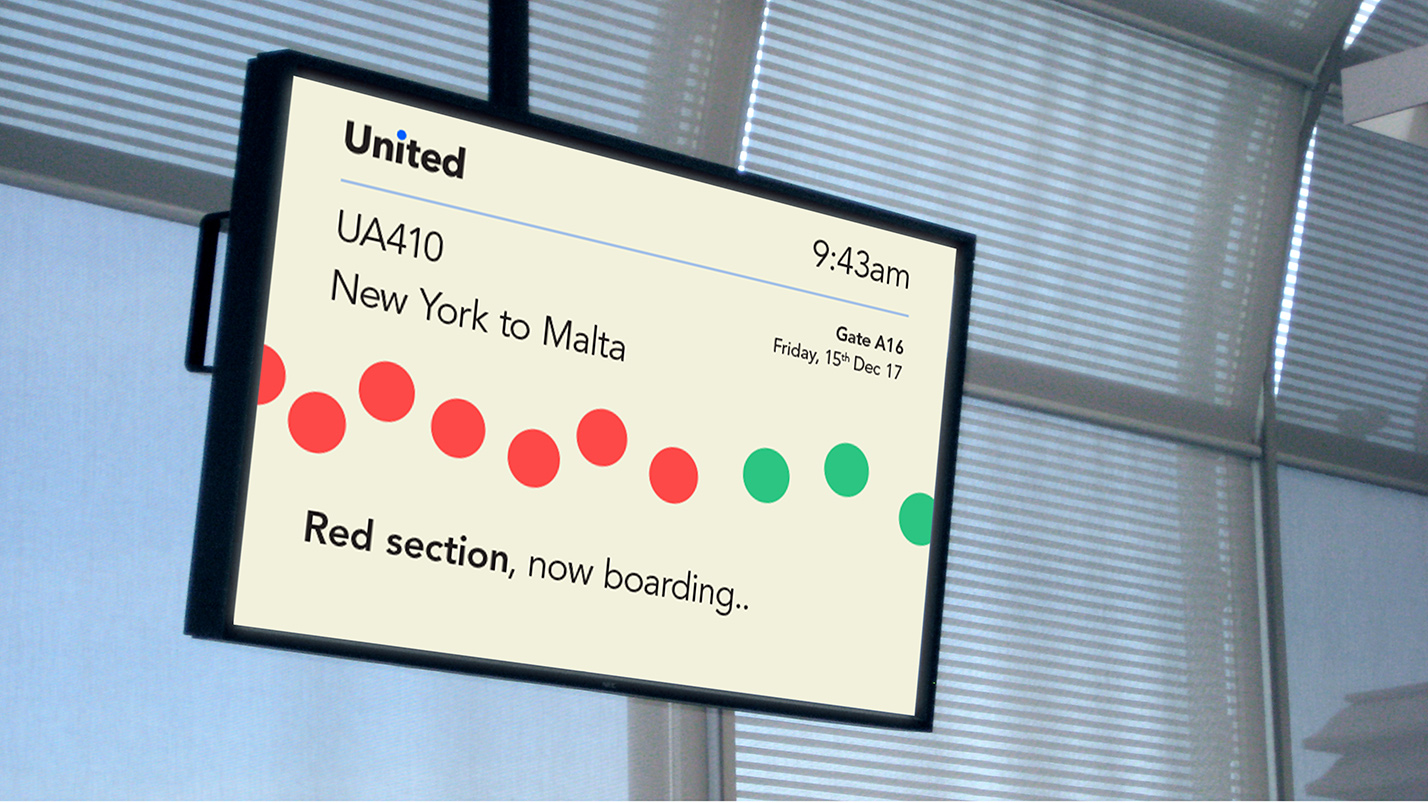
Through the boarding process..

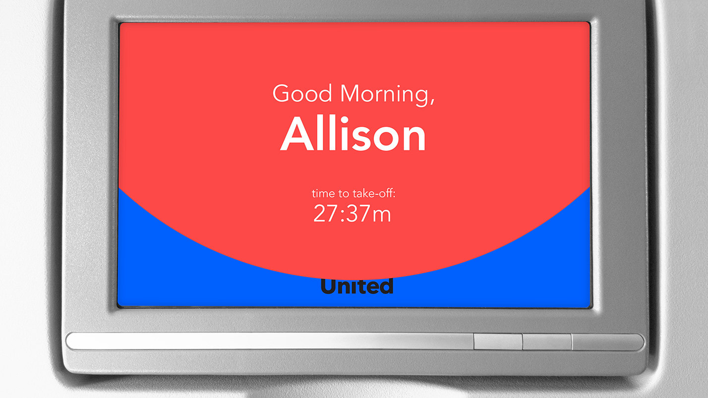
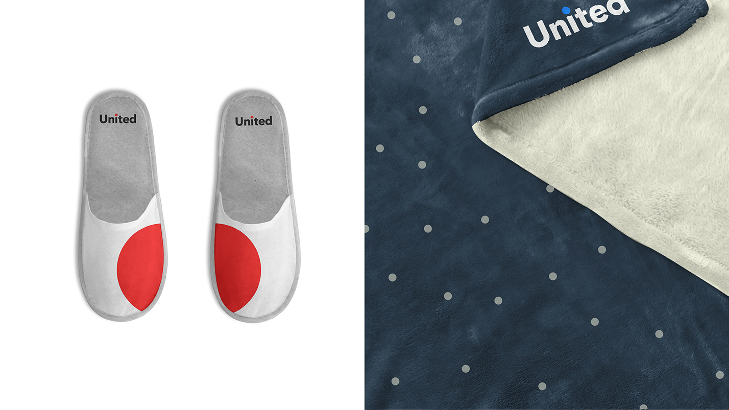
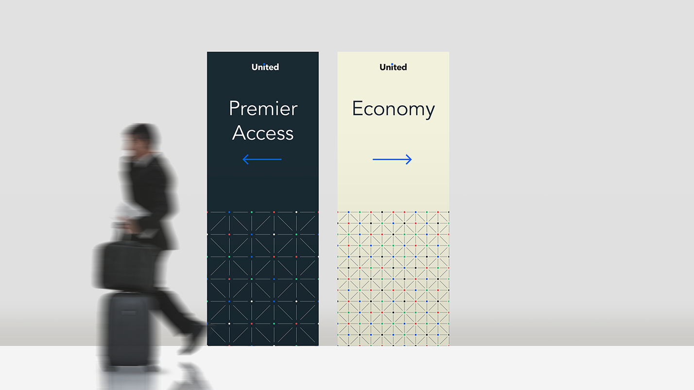
and continues to stay consistent within the plane cabin interiors and giveaways, addressing each customer personally
Credits
Creative team: Wally Krantz, Jane Boynton, Mari Irahawa, & me