Scroll to view project
Scroll to view project
Founded in 1970s San Francisco as the now infamous "Est," Landmark struggled for decades to shake-off perceptions of being a "cult-like pyramid scheme." Prior research indicates that employees and participants passionately agree: there is nothing quite like Landmark. But in a rapidly growing self-development industry, the Landmark brand experience struggled to keep up, risking irrelevance and failing to address negative associations.
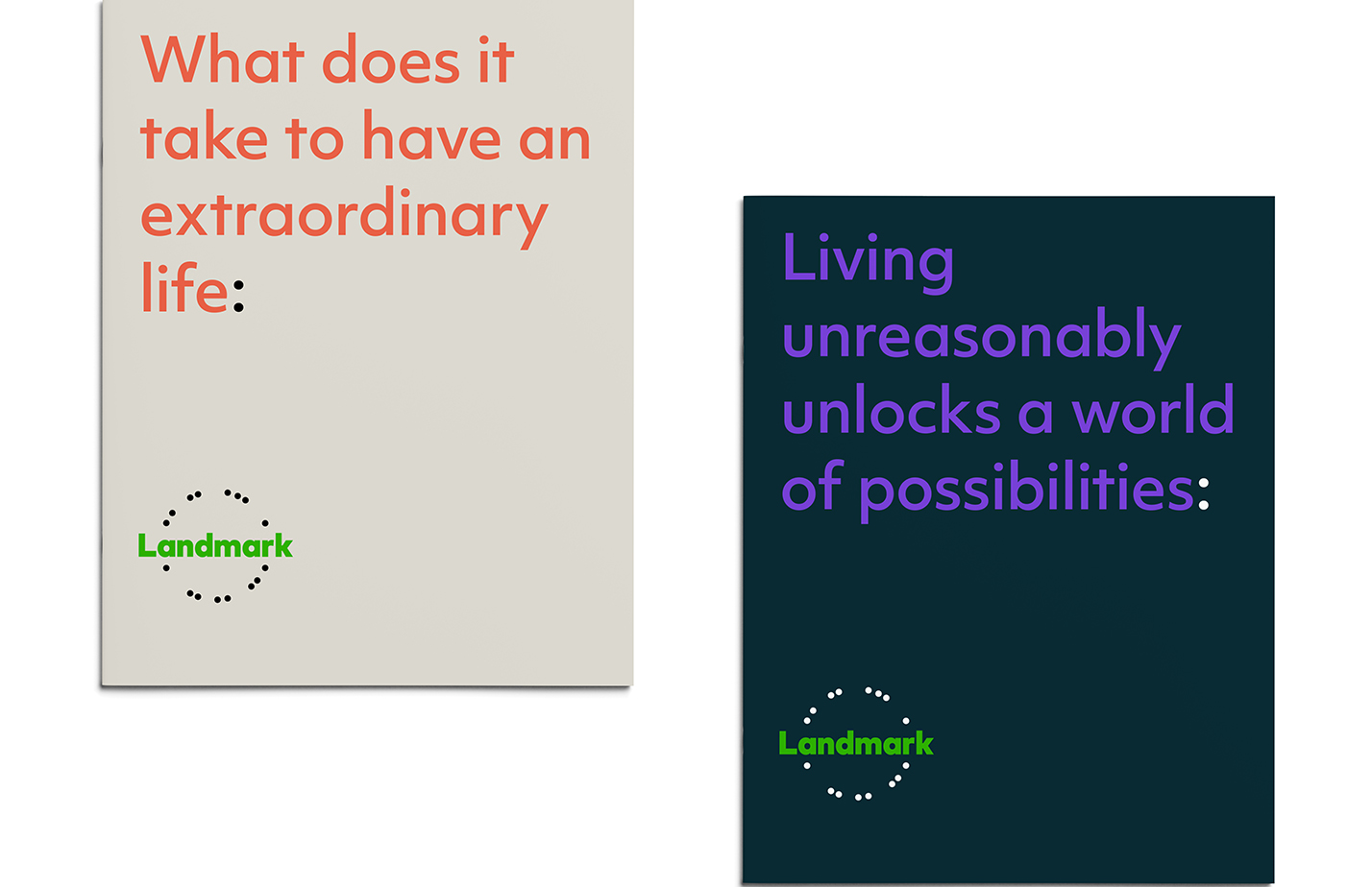
Landmark needed to bring the focus back to the immense personal value they offer - the promise to change one's ideas about themselves and the world, and equip people for a boundless future of their own design. It begins with a spark.
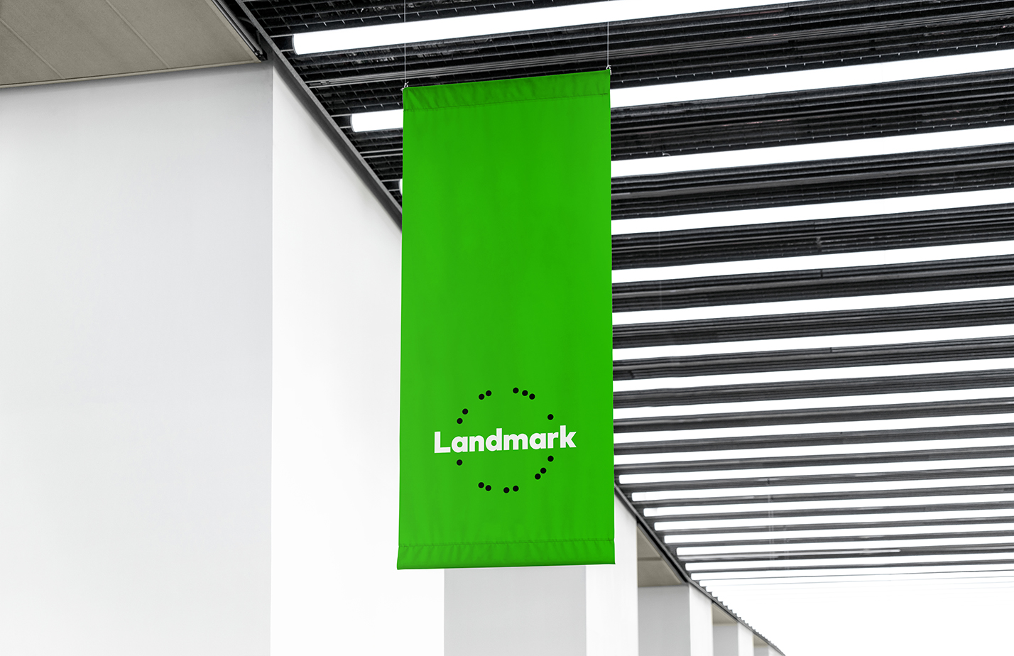
You start at Landmark, then your life grows. The force of this expansion is expressed using particles, they behave in the system as an indication of a person's activity. Green was chosen because it reinforces the idea of growth.
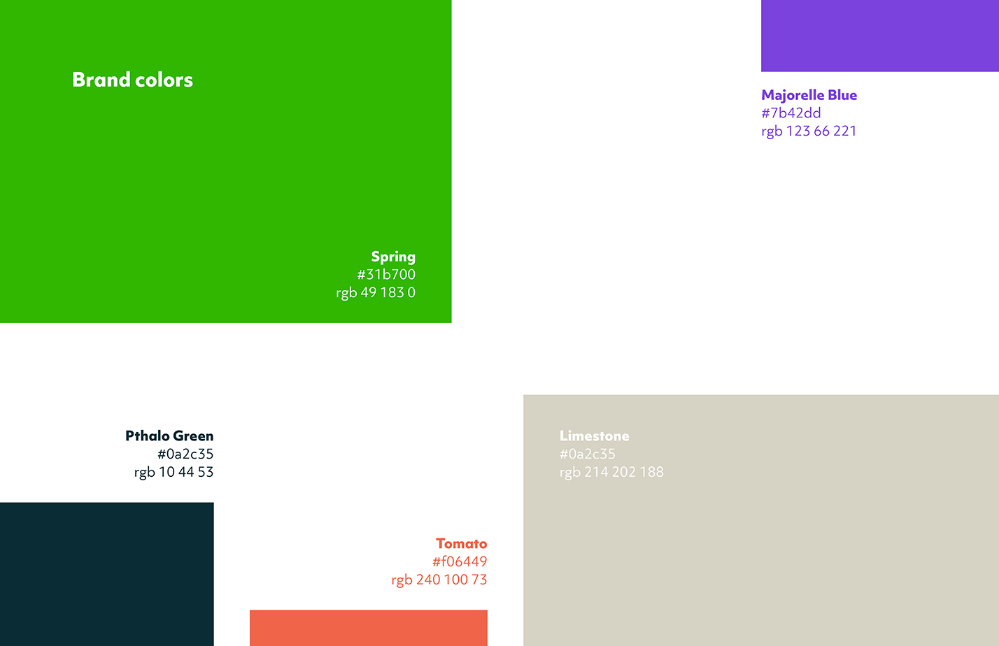
Landmark's supporting colors were designed to be airy, personal, and fresh. Marjorelle blue and tomato lend the visual system breadth, while the muted limestone and dark pthalo green perfectly complements every bright color. Together, they ensure the brand feels expressive, yet consistent, in any combination.
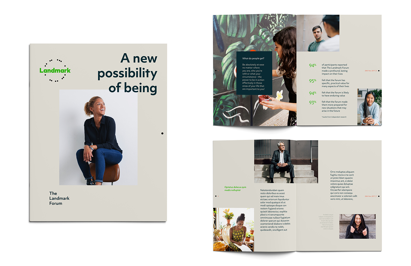
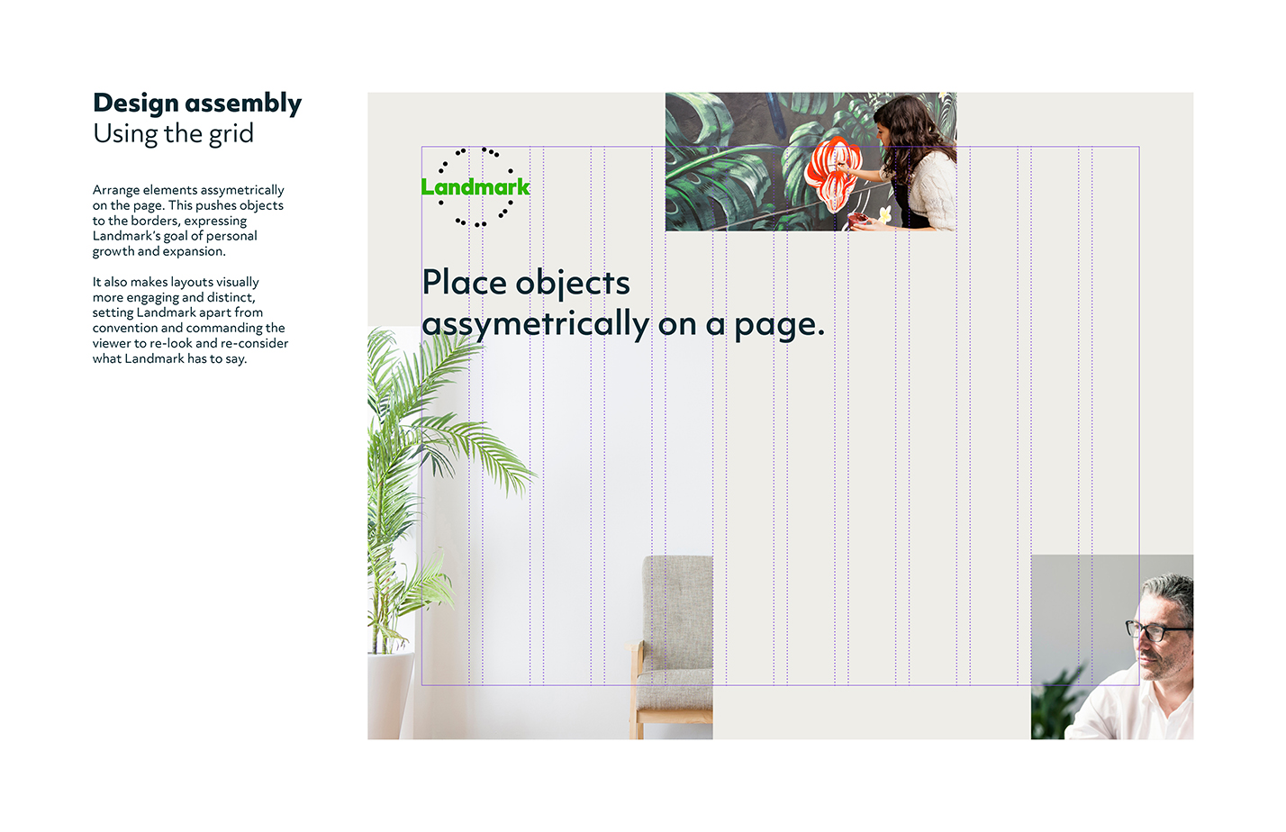
One of the ways Landmark's tools help people achieve personal breakthrough is by helping them question what in their lives they can change. Landmark's layout reflects this dynamic approach to structure, organized into 'moving' blocks that feel like they can be restructured.
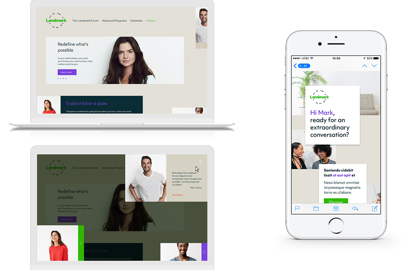
The particles are the graphic elements of the Landmark brand. They can be used to express activity in different ways:

Particles are used as an indicator of attendee action
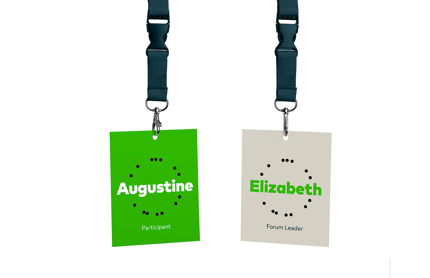
Particles used as an indicator of personal transformation
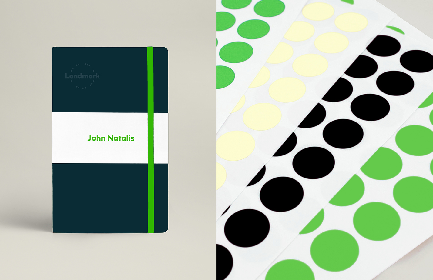
Particles activated by user activity
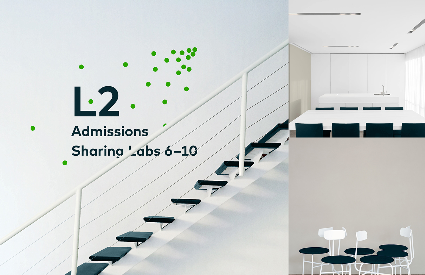
Particles used to indicate direction
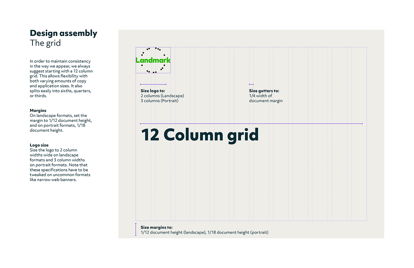
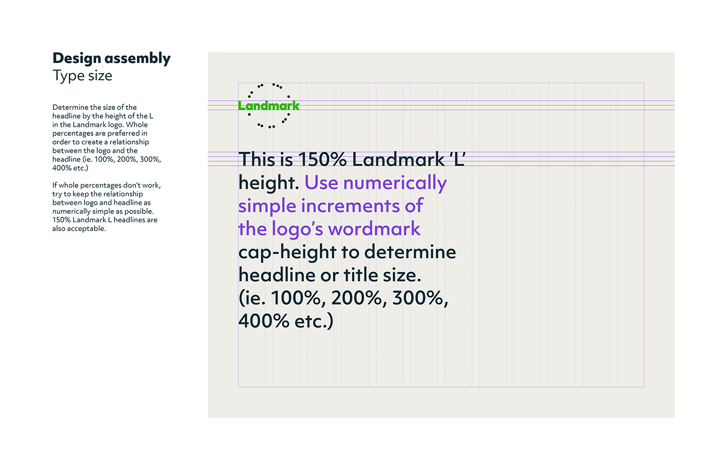
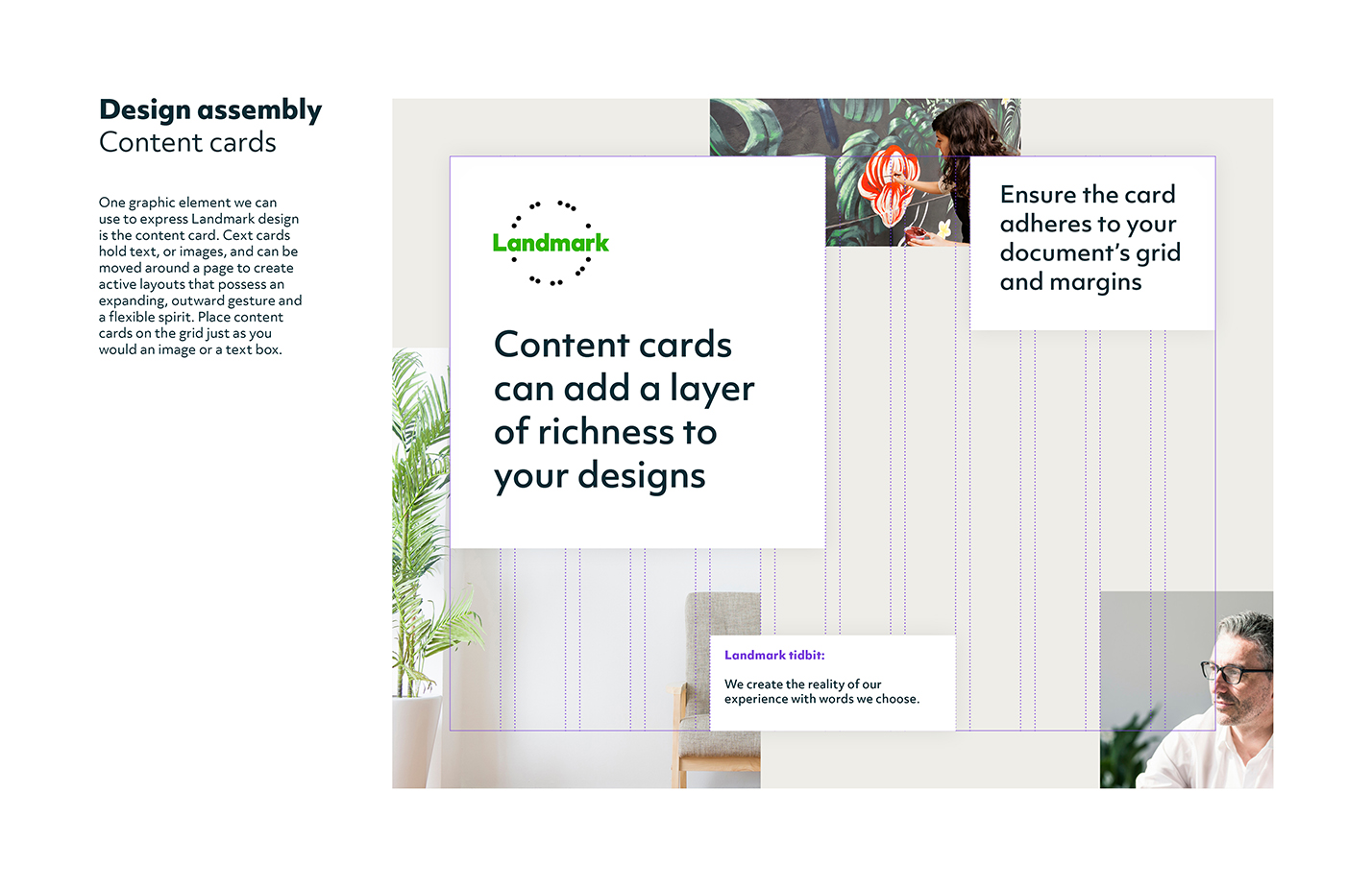
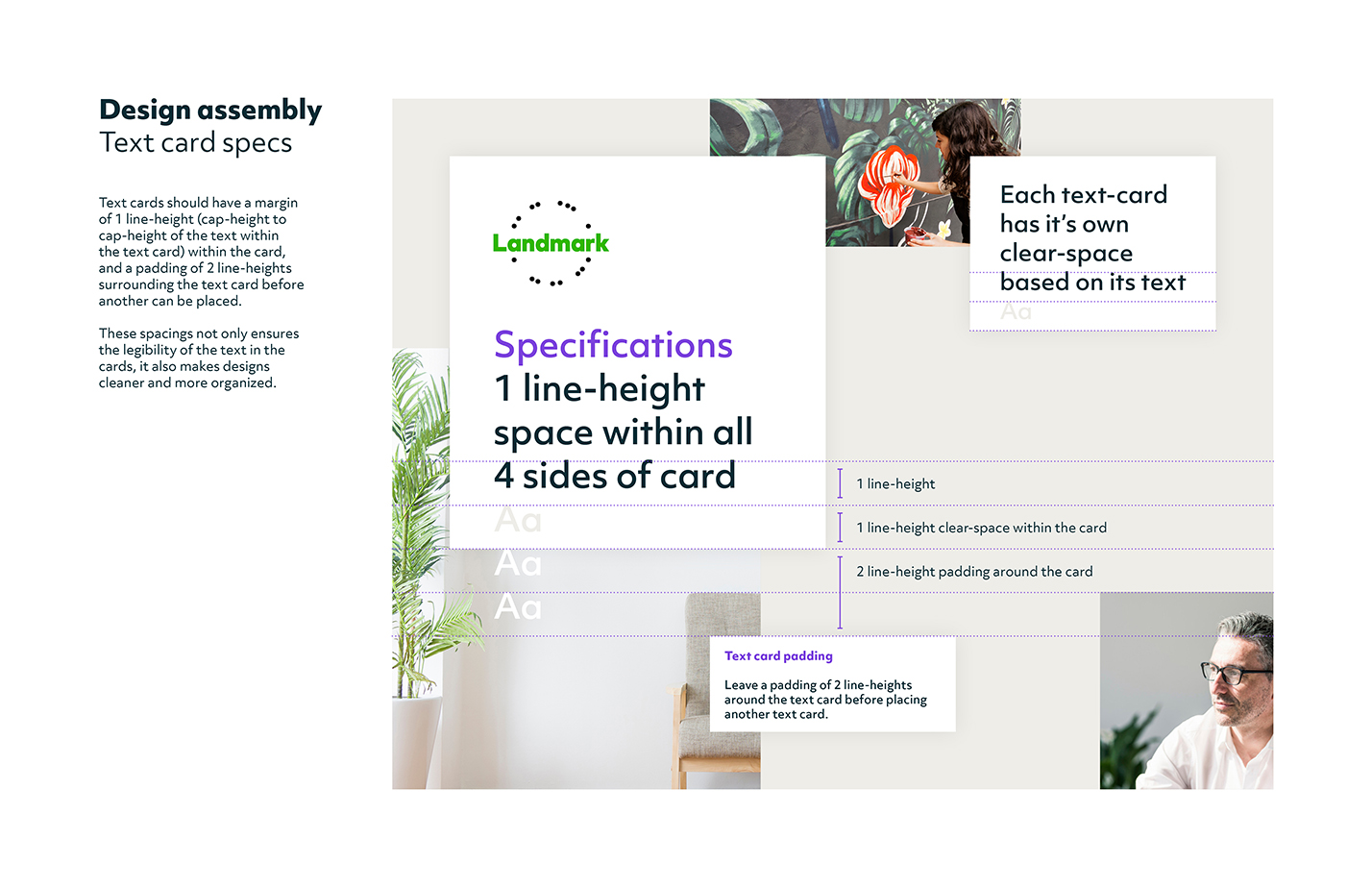
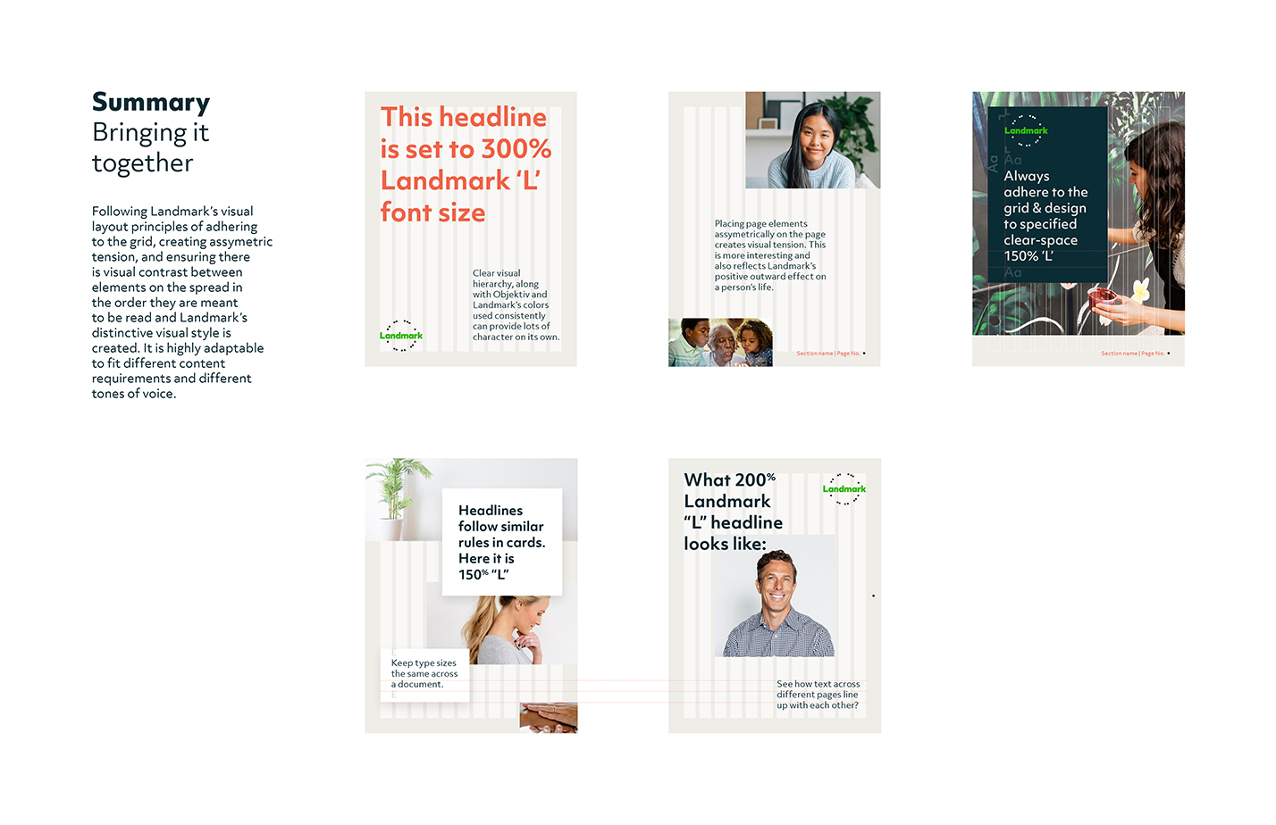
One of the biggest challenges in this redesign was accounting for Landmark's undeveloped design team. They needed very specific tools to help them understand how to achieve the intended visual style. To that effect, we developed step by step instructions, building out designs from a blank page, and providing many examples showing how we put things together.

The new Landmark brand is set to launch globally in 2018, when the identity will be poised to represent personal breakthrough for more generations to come.
Credits
Creative team: Wally Krantz, Beca Lee, & me