Scroll to view project
Scroll to view project
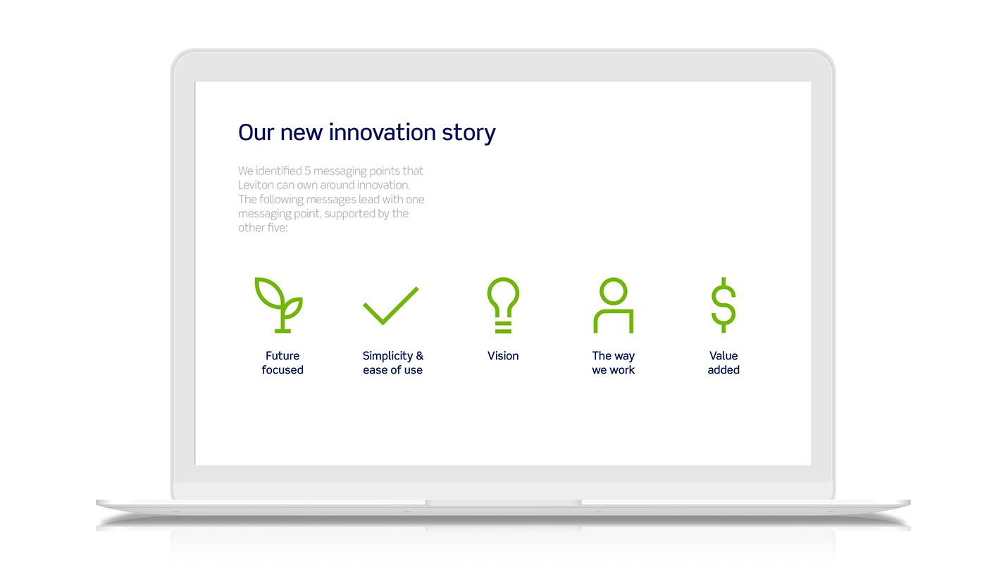
Leviton is repositioning itself from a vendor-of-choice for distributers, to a technology company. Their use of icons was one area we quickly updated to support the perception of that change.
We started this project by examining their previous use of icons, in order to better support how we could create something that would be most useful for them. We identified three primary ways Leviton was using their icon library - as navigational call-to-actions, as supporting visuals for key-points, and as illustrations. And then we structured our icon system around addressing those specific needs, as well as adding visual cues that would make this library distinctively Leviton's.
The Leviton logo
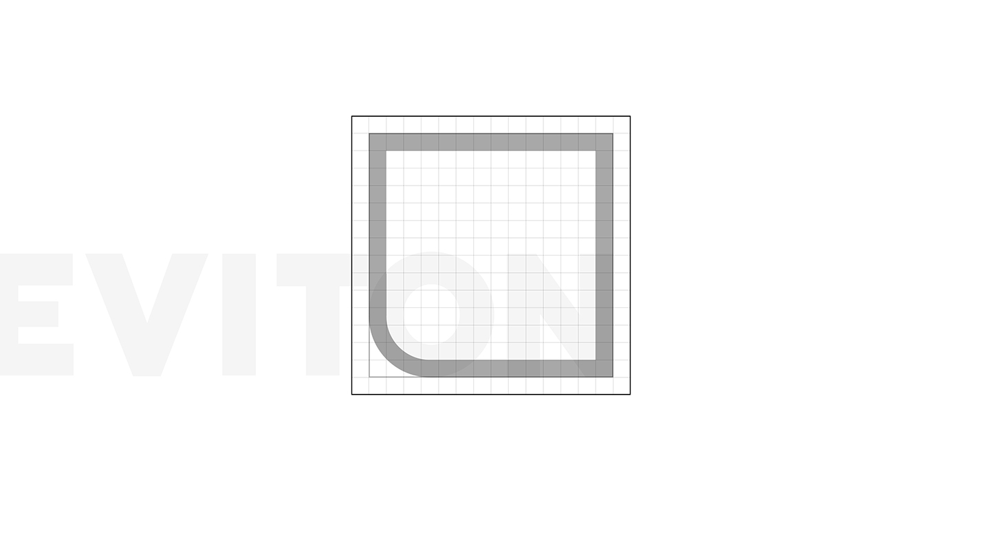
Internally, Leviton already uses the curve found in their logo as a graphic device. Leveraging something their already used to prmotes buy-in internally, as well as serving to make this icon library belong to Leviton
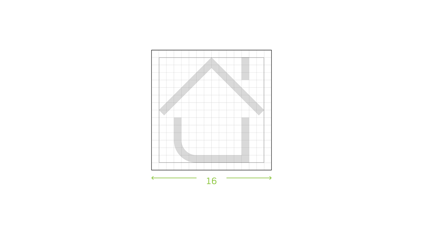
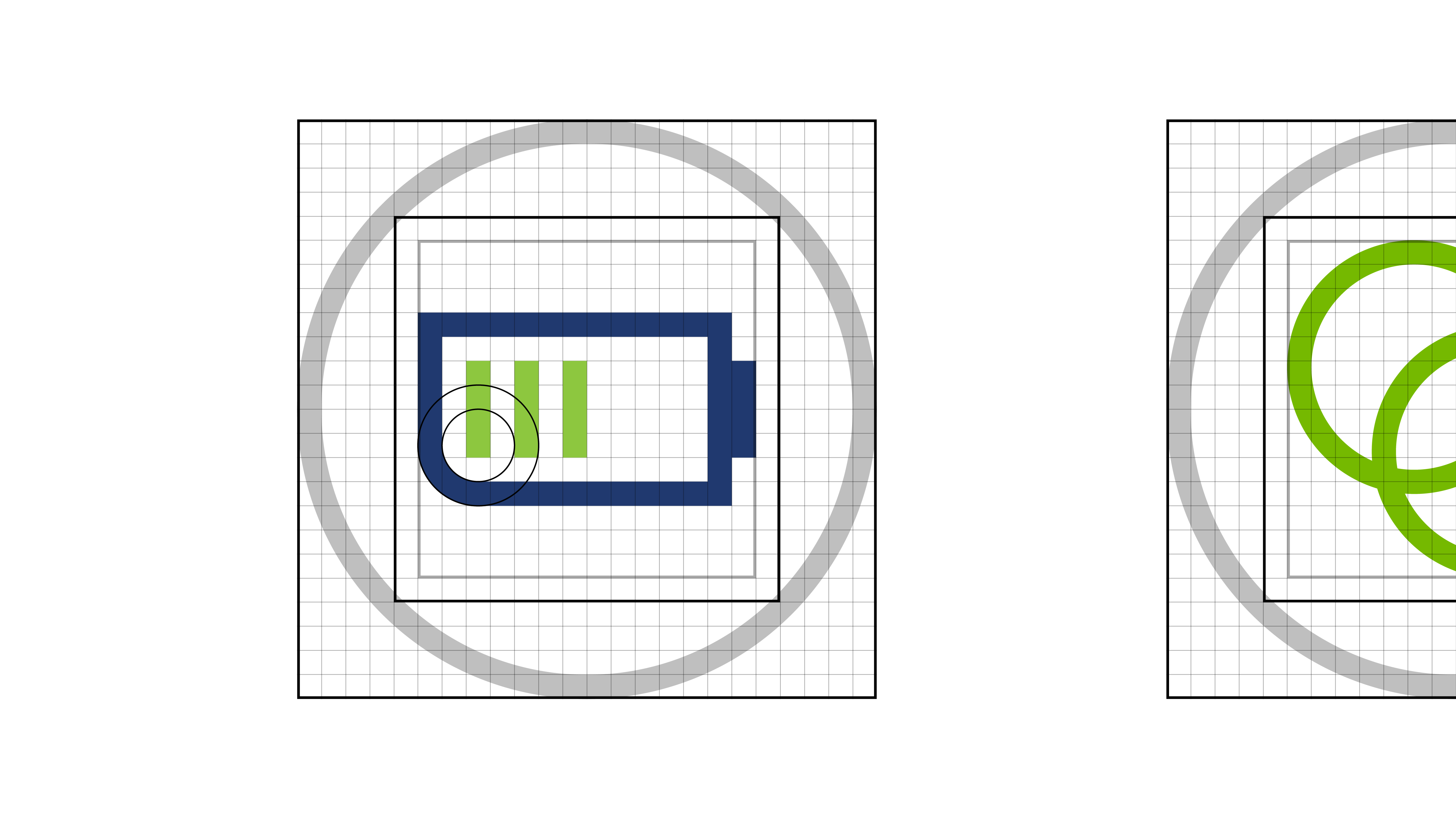
A simple grid ensures legibility at the most demanding sizes, as well as promote visual consistency
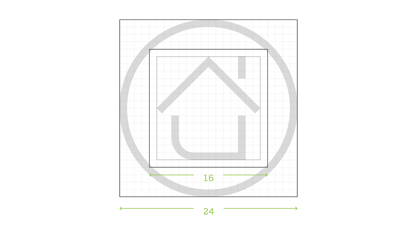
The icons are easily convertible to its different formats, making them easy to create and add to
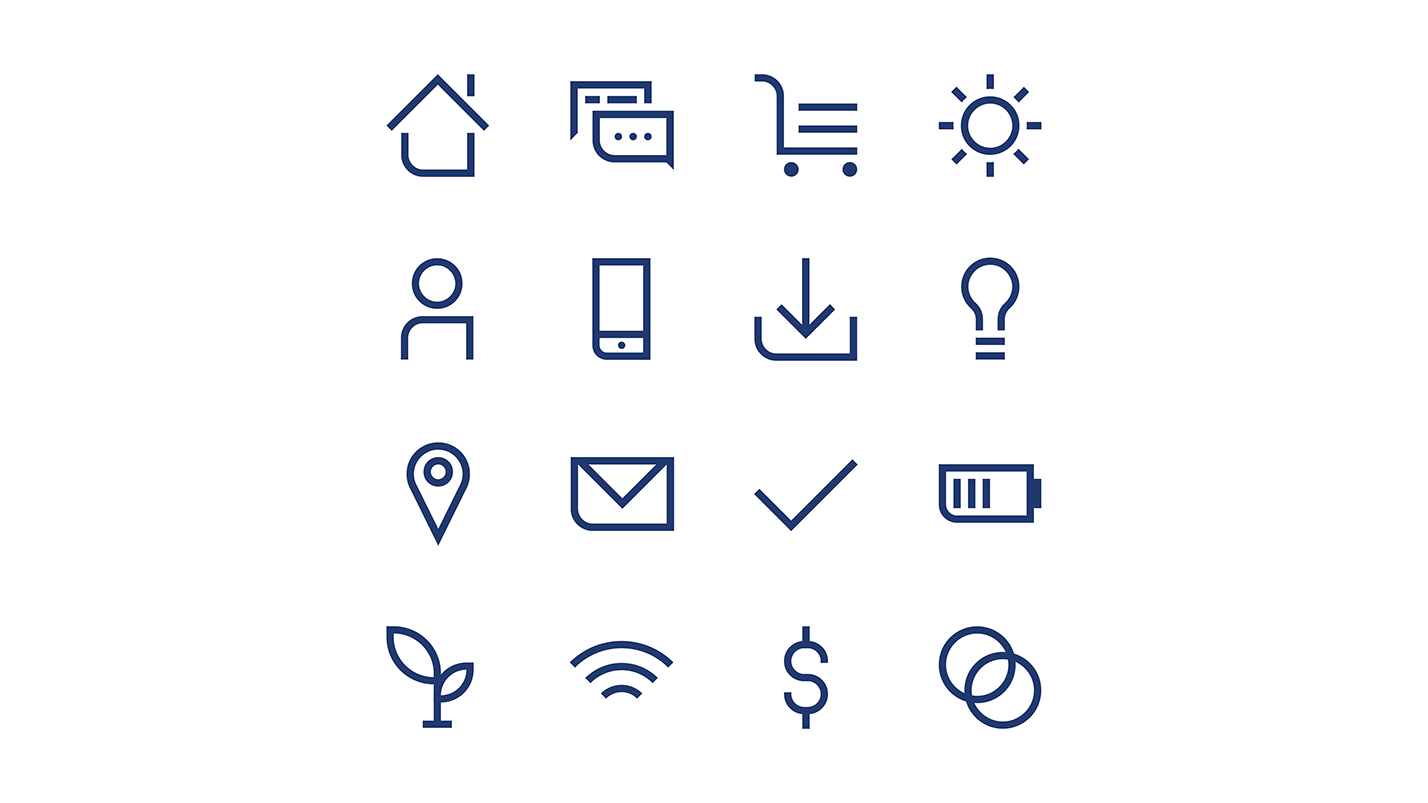
Leviton's new icon style is simple and highly legible. The line icons satisfy their utility as call-to-actions
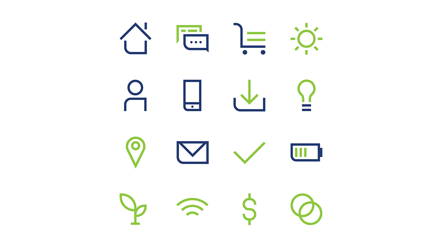
An added color helps to express more of Leviton's identity, and adds visual interest, allowing them to sometimes take the place of illustrations
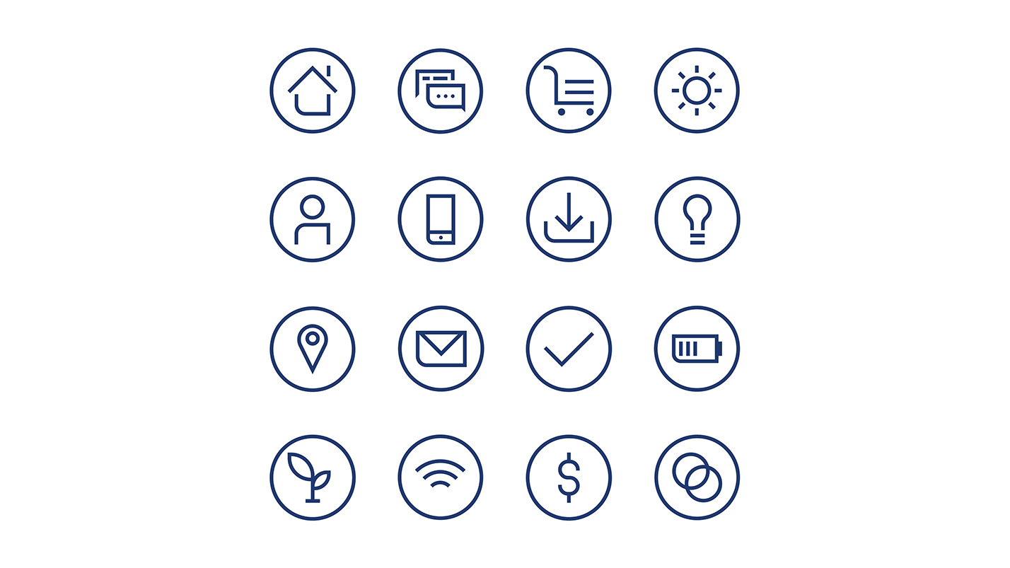
An added holding circle creates a consistent silhouette for the icons, this supports cleaner layouts, and is perfect for supporting visuals for key-points
Leviton icons in application
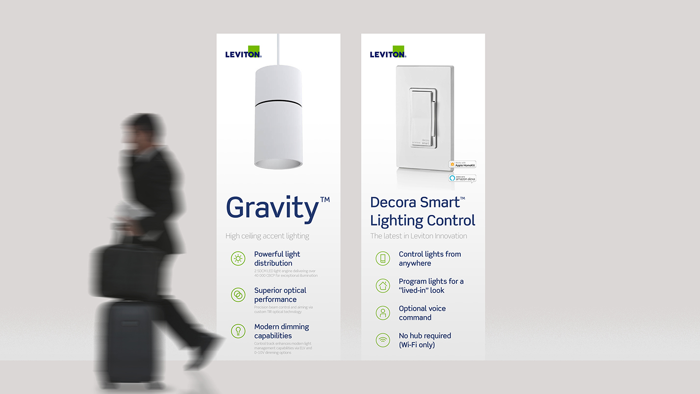
Added holding circle icons used as supporting visuals
Credits
Creative team: Wally Krantz, Jane Boynton, Mari Irahawa, & me